Last Tuesday, I tried buying sunscreen.
Simple task… until I saw fourteen options. SPF 30, SPF 50, tinted, mineral, “active lifestyle,” and somehow I was three tabs deep and questioning my life choices.
Twenty minutes later, I had bought nothing.
Not because I didn’t want sunscreen. I just didn’t want to pick the wrong one.
And somewhere, a store owner whose analytics that day showed a bounce is probably wondering what happened.
I’m what happened.
And I am literally every customer who has ever landed on your product pages, stared at your catalog, felt that slow creep of overwhelm, and quietly left.
That’s where a product recommendation quiz quietly does the job for them.
What Is a Product Recommendation Quiz, Exactly?
Before anything else, it helps to be precise about what we’re actually talking about, because “quiz” gets used loosely, and it matters that yours is built for the right job.
Think of it this way.
You walk into a small wine shop. The owner asks three questions: what are you eating tonight, do you prefer bold or light, and what’s your budget? Two minutes later, he hands you a bottle and says, “This one.”
You buy it. Immediately. Without reading a single label.
That is the product recommendation quiz. The same confidence transfer, embedded directly into your store.
There are two main versions worth knowing before you build:
- Single-category quizzes solve one specific decision (e.g., “Which face oil is right for your skin type?”)
- Multi-category quizzes map the customer’s full picture and recommend bundles or routines across product lines (e.g., “Build your complete skincare routine”)
Which one you need depends on how complex the buying decision actually is, and how big your catalog is.
Why Customers Really Leave (It’s Not What You Think)
Here’s the part most people miss about product quizzes. It’s not just information overload.
Every visitor on your site is dealing with four competing forces at the same time. If your product recommendation quiz solves only one, the other three will still push them to leave.
The Push: The Pain That Sent Them Looking
Push is the specific frustration that made someone open a browser tab in the first place. Wasted money on the wrong serum. Three months of Shopify ads are going nowhere. A supplement routine that stopped working. It’s the moment someone decides “what I’m doing isn’t working anymore.”
Your quiz doesn’t create the Push. It inherits it. The customer arrives already motivated, already dissatisfied, already looking for a way out.
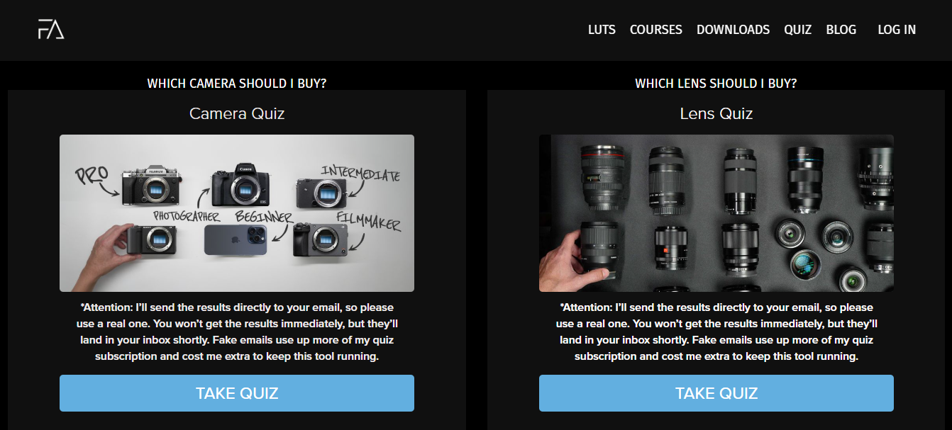
The Film Alliance camera quiz exists entirely because of this force. Buying the wrong camera is expensive, and learning the wrong platform is worse. The quiz catches people at that exact moment of “I cannot afford to get this wrong again” and answers it before they leave.
The Pull: The Better Version They Can Picture
Pull is the specific outcome the customer is quietly hoping for, the version of themselves on the other side of a good purchase. Not “better skincare.” Skin that doesn’t break out before a job interview. Not “a better wardrobe.” Clothes that make getting dressed feel easy instead of stressful.
Pull is emotional and personal, which is why generic result pages lose people.
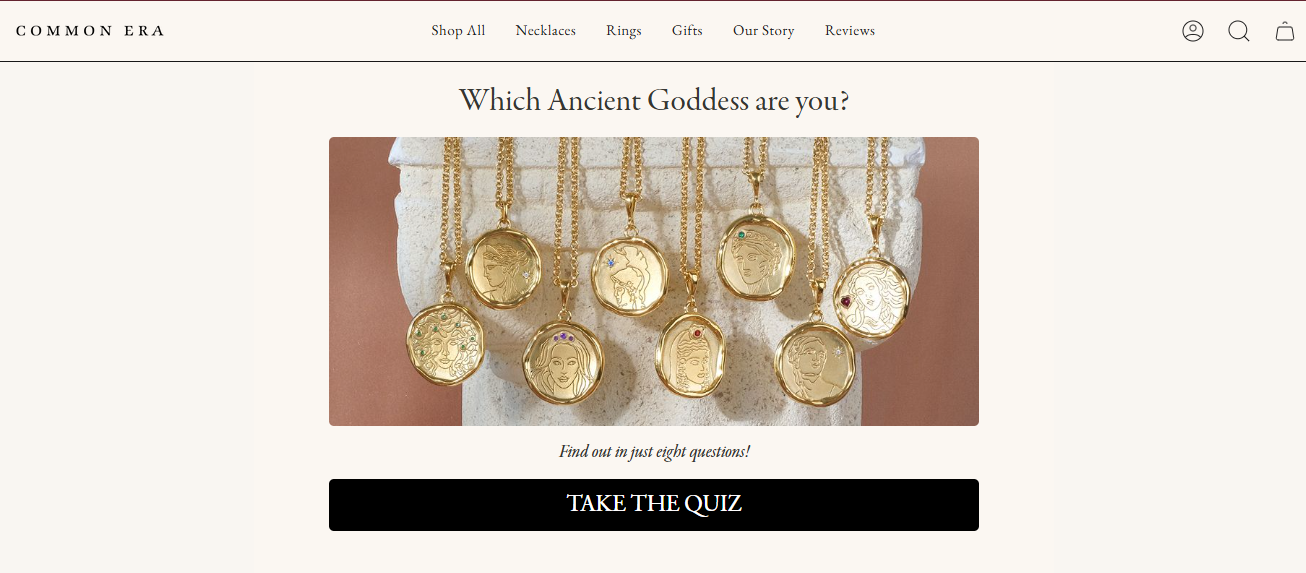
Common Era Jewelry understood this. Their “Which Ancient Goddess Are You?” quiz doesn’t recommend jewelry. It recommends an identity that the customer already wants to step into. The product is secondary to the outcome. If your result page says “we recommend Product X” without connecting it to the outcome they came for, you’ve answered the functional question and missed the real one entirely.
Anxiety: The Fear of Getting It Wrong Again
This is the force most quiz builders completely ignore, and it’s the one doing the most damage.
The customer who wasted $60 on the wrong moisturizer isn’t just looking for a recommendation. They’re looking for reassurance. Every question you ask is a chance to give it to them.
When a skincare quiz asks “Do you tend to break out with heavy moisturizers?”, it isn’t collecting data. It’s signaling: we thought about this. We know this distinction matters. We won’t steer you wrong.
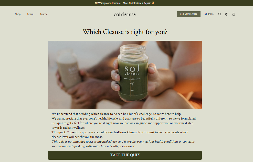
Sol Cleanse does this better than almost anyone. Their quiz directly acknowledges that cleanses feel intimidating, then uses education inside the quiz itself to neutralize that fear before the recommendation ever lands. Customers who feel informed before they buy return less and complain less. Anxiety addressed is a sale protected.
Inertia: The “Good Enough” Habit
This is the hardest force to overcome. It isn’t the frustrated customer. It’s the one who’s just fine with their mediocre current solution. The one who says “I’ll bookmark this” and never comes back.
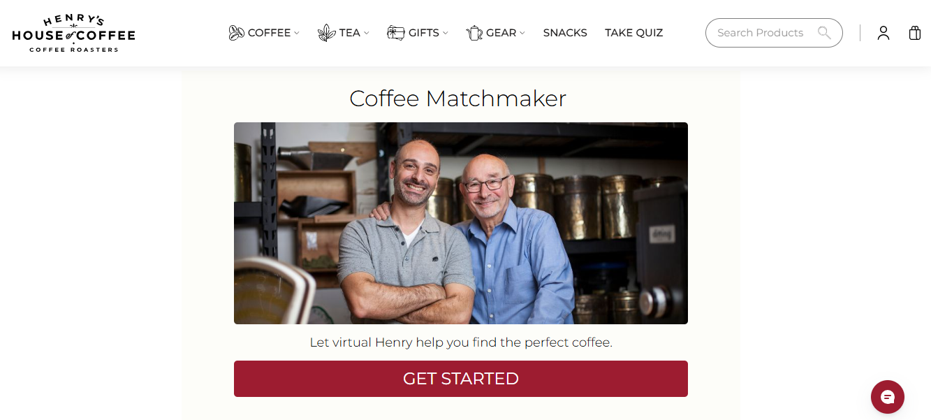
Henry’s House of Coffee built its Coffee Matchmaker quiz specifically for this person. Most coffee buyers just reorder the same bag out of habit, not preference. The quiz feels like talking to a knowledgeable friend who just wants to help, which is the only thing that makes someone willing to try something new. Owner Hrag Kalebjian interviewed his father, a lifelong coffee roaster, to build it. You can feel that in every question.
The fix is always the same: make the Little Hire frictionless. The first question cannot be “Describe your skincare concerns.” That requires effort, and effort is the enemy of inertia. It should be “What’s your skin type?” with four clean image options. Dead easy. One tap.
Because here’s the thing about quizzes and buying decisions:
There are two hires happening. The Little Hire is the customer deciding to click “Start Quiz.” The Big Hire is the customer actually buying something.
If the Little Hire feels like work, the Big Hire never happens.
Do This Before You Touch a Quiz Builder
This is the step most quiz projects skip entirely, and it’s the reason most quizzes underperform despite looking perfectly functional.
Write a Job Story. Not a persona. Not “targeting 30-year-old women interested in skincare.” A Job Story describes the specific moment your customer is in when they arrive at your quiz.
It sounds like this:
“When I’m browsing a new skincare brand at 11 PM, overwhelmed by twenty different serums, I want a quick way to find something right for my skin type, so I can stop second-guessing and go to bed knowing I won’t wake up with a breakout.”
See the difference? The persona tells you demographic information. The Job Story tells you the emotional context, the time pressure, the specific anxiety, and the exact outcome they’re hoping for.
Build your quiz questions around that moment, not around your product catalog. Every question should address one of three dimensions of that customer’s job:
| Dimension | What they actually want | Example |
| Functional | Find the right thing fast, without effort | “Find the right face oil in 30 seconds” |
| Emotional | Feel confident the choice won’t backfire | “Not waste money on something that causes a breakout” |
| Social | Experience a result that other people notice | “Have people ask why my skin looks so good?” |
A quiz that only addresses the functional dimension (“here’s the product that matches your filters”) is doing a fraction of the work available to it. The quizzes people share, the ones that become word of mouth, the ones that drive repeat purchases, those address all three.
Watch: How to Create Customer Acquisition Quizzes
How to Create a Product Recommendation Quiz That Actually Works
Getting this right is less about the tool you use and more about the decisions you make before you log into any platform. These six steps are what actually determine whether your quiz converts.
Step 1: Align the Customer Goal With the Business Goal
Your business goal and the customer’s goal need to be aligned before a single question gets written.
Your goal: increase conversions on a specific category, capture quality email addresses, and lift average order value through bundle recommendations.
Their goal: find the right thing without having to think about it, and feel confident enough in the recommendation to actually buy.
If these two aren’t pulling in the same direction, the quiz will feel like a lead-capture form wearing a quiz costume. Customers sense that immediately. (You’ve felt it yourself. You know the type.)
Step 2: Write Questions Around the Struggle, Not the Catalog
Start with the Job Story. Then ask: What would a good salesperson ask in the first thirty seconds of a real conversation?
- For skincare: skin type, primary concern (specific, not general “goals”), texture preference, current routine.
- For apparel: occasion, fit priority, one specific concern (comfort vs. aesthetics), style preference.
- For food: heat tolerance on a concrete scale, flavor profile, primary use case.
- For supplements: main health goal, one dietary restriction, one current challenge.
Use “you” and “your” throughout. Use image-based answer options wherever the product is visual. Cap answers at four per question. And be ruthless about cutting: if removing a question wouldn’t change any recommendation a customer receives, it doesn’t belong in the quiz. It’s just friction disguised as thoroughness.
Step 3: Map the Logic Before You Build Anything
This is what separates a product recommendation quiz from a survey.
Before you open any quiz builder, draw this out somewhere.
Trace every possible answer path from Question 1 to a result.
Every answer should branch to either a follow-up question or a specific product.
If two completely different customer profiles are landing on the same recommendation, your logic needs work.
If any path leads to a dead end, fix it now, not later.
Once this is clear, building becomes mechanical. This is where tools like ProProfs Quiz Maker can help without forcing you into rigid templates.
You can use AI to generate a starting draft of your quiz. (Try for yourself)

Let ProProfs AI Build a Quiz
Then layer your own logic on top with branching paths so each answer actually leads somewhere meaningful instead of looping back into generic outcomes.
Step 4: Build the Result Page Like It’s a Sales Conversation
Eighty percent of the effort goes into the questions. The result page gets a product image, a button, and three words of copy.
And then people wonder why completion rates don’t translate to purchases.
A result page that actually converts does this:
- Names the product and shows it clearly
- Explains in one or two sentences why it fits the specific answers they gave (not copy-pasted from the product description)
- Includes one piece of social proof: a review, a stat, a real outcome
- Puts the Add to Cart button immediately in view, not below a wall of text
- Optionally asks for an email before revealing the result (test this before committing; it works brilliantly for some brands and kills others)
Pro Tip: You can also reduce cart abandonment by implementing exit intent popups using a pop-up tool, such as Picreel, on your website to re-engage visitors.
Watch: What Is Exit Popup Software & How It Increases Conversion
Step 5: Name It Like a Service, Not a Gimmick
“Product Finder” is functional. “Which [Product] Is Right for You?” is better. “[Brand] Matchmaker” works if your brand has that warmth.
The name sets the expectation before the first question loads. If it sounds like a BuzzFeed personality quiz, expect BuzzFeed-level engagement: high starts, low conversions.
Step 6: Put It Where the Decision Gets Made
Test placement on category pages (where choice overload is highest), product pages with multiple variants (where confusion peaks), and your homepage if your catalog is broad.
A quiz buried in the footer is a decoration. It belongs at the exact moment the customer is most likely to feel overwhelmed. That is the only moment it’s actually useful.
What Features Should You Actually Look For in a Quiz Builder?
Not every quiz tool is built for product quiz design guidelines for websites. A lot of them are glorified surveys with a makeover. Here’s what separates the tools that convert from the ones that just look nice in a demo:
| Feature | Why It Actually Matters |
| Conditional branching logic | Without this, everyone gets the same result regardless of their answers. It’s not a quiz. It’s a funnel. |
| No-code customization | You’ll need to edit this thing constantly. A developer dependency is a conversion bottleneck. |
| Mobile responsiveness | More than half of eCommerce traffic is mobile. A desktop-only experience loses half your audience before the first question. |
| Shopify and Klaviyo integration | The recommendation is only as valuable as what you do with the data afterward. |
| A/B testing | The first version of any quiz is never the best version. You need to test question order, result framing, and email gate placement. |
| Full-funnel analytics | Starts, completions, result-page views, and add-to-cart rates. Not just completion rates. |
| Lead capture gating | The option to require an email before showing results, with the ability to turn it off when it isn’t working. |
A few tools worth knowing for ecommerce quiz best practices:
- Typeform handles simpler catalogs well and looks beautiful doing it.
- Digioh is purpose-built for product matching at scale.
- RevenueHunt (Shop Quiz) connects directly to your Shopify catalog and maps logic to your actual inventory.
For teams that also need assessment, lead qualification, or certification workflows on the same platform, ProProfs Quiz Maker covers product recommendation quizzes alongside broader use cases, including branching logic, email gating, full-funnel analytics, and Shopify integration. Free plan covers the essentials. Paid plans start at $19.99/month.
Types of Product Quizzes for Online Shopping: Real Examples Worth Studying
Seeing how real brands use quizzes is more useful than reading about them in abstract terms, so let’s look at how the guide to creating product finder quizzes for ecommerce actually plays out across categories.
Beauty (Jones Road): Runs separate quizzes for Miracle Balm and Foundation, matching customers to the right shade based on skin tone and coverage preference. The quiz directly addresses the emotional job: “I don’t want to order something online that looks wrong on me.” Every question chips away at that specific anxiety. This is one of the cleaner ecommerce quiz best practices examples around.
Apparel (Stitch Fix): Turned its entire business model into a style quiz. The profile collects enough preference data to power ongoing personalization, not just one recommendation. The quiz isn’t a feature here. It’s the product.
Food (Heatonist): Maps heat tolerance and flavor profile to hot sauce recommendations. The questions are genuinely fun because they speak to the social dimension of the job: customers want to discover something they’ll tell people about at dinner.
Supplements (Arey): Guides customers through questions about hair condition, lifestyle, and goals to recommend a grey-slowing supplement protocol. The quiz does education work that the product page could never do in a quick scroll.
SaaS and non-eCommerce: If you don’t have a product catalog to scan, build a decision-tree quiz that maps customer challenges to use cases. The result becomes a trial signup or demo request instead of an Add to Cart button. The guide to creating product finder quizzes for ecommerce applies here, too, just with a different conversion moment at the end.
The Part That Happens After They Click “Add to Cart”
Most product quiz guides, and honestly, most quiz tools’ own documentation, treat the Add to Cart button as the finish line.
It isn’t.
The customer has made the Little Hire by trusting your recommendation, but the Big Hire, experiencing the actual results, is still ahead. That gap is a rare opportunity to do what most brands won’t.
A few things that close that gap and turn a one-time purchase into something more:
The confirmation email should specifically explain why this product fits them, using their actual answers. Not a generic order confirmation. A personalized “here’s what you told us, here’s what to expect” message that reinforces the progress they’re about to make.
First-use guidance tailored to the quiz result prevents customers from making a common mistake on the first try, which is usually what leads to a bad review or a return. If the quiz indicates that someone has sensitive skin, the follow-up email should mention it.
The unboxing moment can reference the quiz. A short card that says “Based on your skin profile, here’s what to know about using this for the first time” is doing relationship work that no product page ever could.
The customer-provided data doesn’t expire at checkout. That’s the real product quiz benefit for customers that nobody talks about in the conversion rate articles.
How to Know If Your Quiz Is Working
Build it. Then measure these, in this order:
- Completion rate: Below 30% means the quiz is too long or the questions feel irrelevant. Above 60% is healthy. Fix this before anything else.
- Starts-to-add-to-cart rate: The real metric. Not result-page views. How many people who started the quiz ended up adding something to their cart?
- Lead capture rate (if gated): Below 20% means the value exchange isn’t landing, or the gate is too early. Test ungated on a subset of traffic and compare the full funnel.
- Result-page drop-off: If people reach the result but don’t buy, the result page needs work. Not the questions.
One more thing: a product recommendation quiz for ecommerce is a conversion optimizer, not a traffic generator. If your site has thin traffic, the quiz will not fix that. What it will do is convert a meaningfully higher percentage of visitors who are already showing up. On any real volume, that gap compounds fast.
Your Customers Already Know What They Want. Help Them Find It.
Here’s the thing about that sunscreen decision I bailed on.
I didn’t want to be educated. I didn’t want to read more copy. I didn’t want fourteen tabs open, and a Reddit thread telling me mineral is better but also worse depending on your skin tone, and also it depends on the reef.
I wanted someone to ask me three questions and hand me a bottle.
That’s it. That is the entire job.
A product recommendation quiz for ecommerce isn’t a marketing feature. It’s a service. It’s the store deciding to meet customers where they actually are, in the middle of a decision that feels harder than it should, and making it easier.
Build it to serve the customer first. Address the anxiety, not just the function. Follow the job past the checkout button.
The conversion lift will follow. It always does, when the thing you built actually helps.
Frequently Asked Questions

What are the benefits of product quizzes for customers?
Customers get a fast, personalized recommendation without having to research or compare products themselves. They also get reduced decision anxiety, since the quiz signals that someone with expertise designed the path to avoid common mismatches. Better recommendations mean fewer returns and more repeat purchases.
How many questions should a product recommendation quiz have?
Three to five questions is the proven sweet spot for ecommerce quiz best practices. Completion rates fall sharply beyond seven. Start with the easiest possible question, keep answer options visual where you can, and cut any question that doesn't change which product the customer receives.
What is zero-party data and why do quizzes collect it?
Zero-party data is information a customer deliberately shares in exchange for something of value, like a personalized product recommendation. Unlike behavioral tracking, it's accurate because customers gave it to you intentionally, and ethical because they chose to. It powers better email segmentation, retargeting, and product development.
Should I gate my quiz results behind an email form?
Test both. Gating results can triple email list growth, but it reduces completions when the value exchange feels forced. Run gated and ungated versions on separate traffic splits and compare the full funnel, not just list growth in isolation.
What is a Job Story and why does it matter for quiz design?
A Job Story describes the specific moment a customer is in when they arrive at your quiz: their situation, their goal, and the anxiety they're trying to resolve. Building questions around Job Stories instead of your product catalog produces quizzes that feel personal rather than algorithmic. It's the foundation of good product quiz design guidelines for any website.
Can a guide to creating product finder quizzes for ecommerce apply to service businesses?
Yes. The logic is identical: ask about the customer's situation, route them to the most relevant offer. Instead of Add to Cart, the result becomes a demo request, a consultation booking, or a trial signup. The quiz qualifies the lead and sets accurate expectations before anyone talks to sales.
What makes a result page actually convert?
A result page that names the product, explains specifically why it fits their answers (not generic copy), includes one piece of social proof, and puts the Add to Cart button immediately in view. The more personal it sounds, the higher it converts. Generic results pages are where good quizzes go to die.
Let ProProfs AI Build a Quiz
 We'd love your feedback!
What did you like & how can we make it even better?
 Thanks for your feedback!
 Ask Your Question
Have a question? Get expert help to make your decision easier.