The Ultimate Typography Quiz!

The Ultimate Typography Quiz: One line definition of Typography is a technique of arranging the written text in an appealing manner with the use of visual styles and art. Now, this quiz features 20 essential questions that you must answer to call yourself a master typographer.
- 1.
What is a typeface?
- A.
The production of typefaces.
- B.
The overall design of type characters.
- C.
The technique of arranging typefaces.
Correct Answer
B. The overall design of type characters.Explanation
A typeface refers to the overall design of type characters, including their shape, style, and appearance. It encompasses various elements such as the size, weight, and spacing of the characters. Typeface is different from the production or manufacturing of typefaces, which involves the creation and development of new fonts. It is also distinct from the technique of arranging typefaces, which pertains to the skill of selecting and organizing different fonts in a visually appealing manner.Rate this question:
-
- 2.
What is typography?
- A.
The adjustment of space between groups of letters.
- B.
A common design with a with a set of weights and style.
- C.
The technique of arranging typefaces.
Correct Answer
C. The technique of arranging typefaces.Explanation
Typography is the art and technique of arranging typefaces in a visually appealing and effective manner. It involves selecting appropriate fonts, sizes, spacing, and layouts to convey a message or evoke a certain mood. The correct answer, "the technique of arranging typefaces," accurately describes the essence of typography, which goes beyond simply choosing a font and encompasses the skillful arrangement of various type elements to create a harmonious and impactful design.Rate this question:
-
- 3.
What is kerning?
- A.
The adjustment of space between groups of letters.
- B.
The adjustment of space between adjacent type characters to optimise their appearance.
- C.
Measurement of type size; distance from the highest ascender to the bottom of a descender.
Correct Answer
B. The adjustment of space between adjacent type characters to optimise their appearance.Explanation
Kerning refers to the adjustment of space between adjacent type characters to optimize their appearance. This is done to ensure that the spacing between letters is visually pleasing and consistent, avoiding any awkward or uneven gaps. By adjusting the kerning, the overall readability and aesthetics of the text can be improved.Rate this question:
-
- 4.
What is tracking?
- A.
The adjustment of space between groups of letters.
- B.
The adjustment of space between adjacent type characters to optimize their appearance.
- C.
Measurement of type size; distance from the highest ascender to the bottom of a descender.
Correct Answer
A. The adjustment of space between groups of letters.Explanation
Tracking refers to the adjustment of space between groups of letters. It involves increasing or decreasing the spacing between characters in order to improve the overall appearance and legibility of the text. By adjusting the tracking, designers can achieve a more balanced and visually pleasing typography. This can be particularly useful when dealing with headlines, logos, or any other type of text where the spacing between letters plays a crucial role in the design.Rate this question:
-
- 5.
What is point size?
- A.
Measurement of type size; distance from the highest ascender to the bottom of a descender.
- B.
The adjustment of space between groups of letters.
- C.
The adjustment of space between adjacent type characters to optimize their appearance.
Correct Answer
A. Measurement of type size; distance from the highest ascender to the bottom of a descender.Explanation
Point size refers to the measurement of type size, specifically the distance from the highest ascender (the part of a lowercase letter that extends above the x-height) to the bottom of a descender (the part of a lowercase letter that extends below the baseline). It is a way to determine the physical size of a font when printed or displayed on a screen. This measurement is typically expressed in points, with one point equal to 1/72 of an inch.Rate this question:
-
- 6.
What is leading?
- A.
The vertical space between lines of type, and affects the readability of text.
- B.
The adjustment of space between groups of letters.
- C.
The adjustment of space between adjacent type characters to optimize their appearance.
Correct Answer
A. The vertical space between lines of type, and affects the readability of text.Explanation
Leading refers to the vertical space between lines of type. It plays a crucial role in the readability of text by providing enough space for the eye to move smoothly from one line to the next. Adequate leading ensures that lines do not appear cramped or crowded, making it easier for readers to follow the text without strain. Insufficient leading can result in lines blending together and making the text difficult to read, while excessive leading can cause the text to appear disjointed and disjointed.Rate this question:
-
- 7.
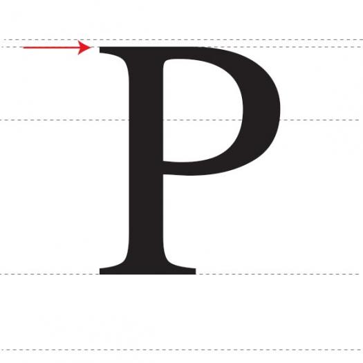
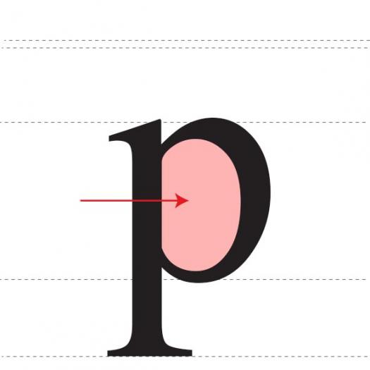
Name the area indicated by the red arrow.
- A.
Stem
- B.
Bowl
- C.
X-height
Correct Answer
C. X-heightExplanation
The area indicated by the red arrow is the x-height. The x-height refers to the height of lowercase letters in a typeface, specifically the height of the lowercase "x". It is an important measurement in typography as it affects the overall legibility and readability of the text.Rate this question:
-
- 8.
The name of the invisible line marking the height of a font.
- A.
Ascender line
- B.
Baseline
- C.
X-Height
Correct Answer
A. Ascender lineExplanation
The ascender line is the correct answer because it refers to the invisible line that marks the height of the ascenders in a font. Ascenders are the parts of lowercase letters that extend above the x-height, such as the top of the letter "h" or "b". The ascender line helps maintain consistent vertical alignment in typography. The baseline, on the other hand, is the line on which most letters sit, while the x-height is the height of the lowercase letters.Rate this question:
-
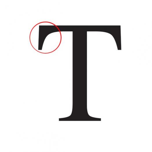
- 9.
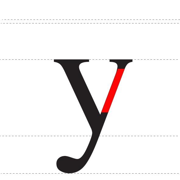
A horizontal or upward sloping stroke.
- A.
Arm
- B.
Leg
- C.
Ear
Correct Answer
A. ArmExplanation
The correct answer is "Arm" because a horizontal or upward sloping stroke is commonly associated with the shape of an arm. The other options, such as leg or ear, do not typically have this specific stroke pattern.Rate this question:
-
- 10.
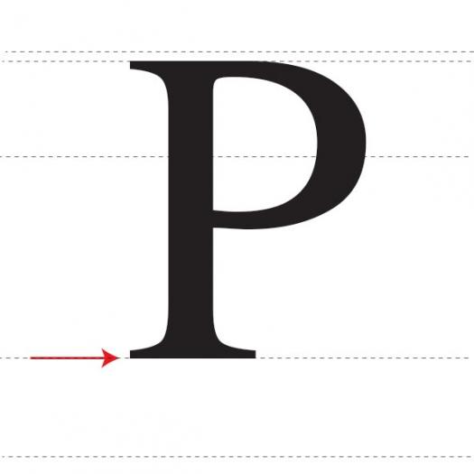
The invisible line where all characters sit.
- A.
X-height
- B.
Baseline
- C.
Crossbar
Correct Answer
B. BaselineExplanation
The baseline is the invisible line where all characters sit in typography. It serves as a reference point for the placement of letters and determines their alignment in a line of text. The baseline provides stability and consistency in the overall appearance of the text. It is essential for maintaining legibility and readability in typography.Rate this question:
-
- 11.
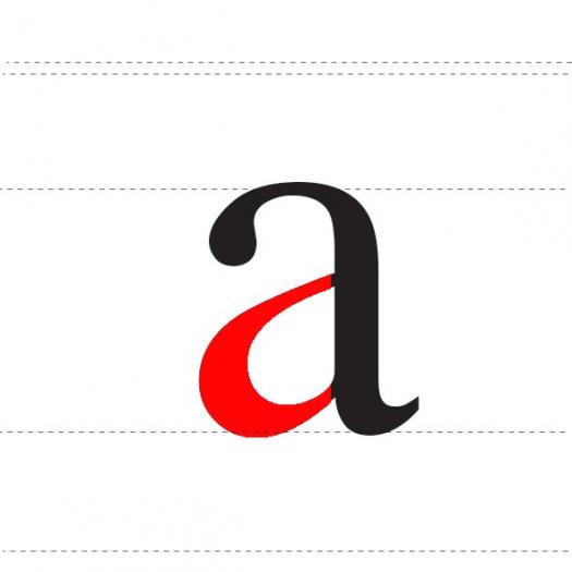
The fully closed, rounded part of a letter.
- A.
Bowl
- B.
Ear
- C.
Tail
Correct Answer
A. BowlExplanation
The term "bowl" refers to the fully closed, rounded part of a letter. In typography, the bowl is the curved part that encloses the counter or aperture of a letter. It is typically found in letters such as "a", "b", "d", "o", and "p". The bowl gives these letters their distinctive shape and helps to differentiate them from other characters in a typeface.Rate this question:
-
- 12.
The height of a capital letter measured from the baseline.
- A.
Stem
- B.
Leg
- C.
Cap height
Correct Answer
C. Cap heightExplanation
Cap height refers to the height of a capital letter when measured from the baseline. It represents the distance from the baseline to the top of the uppercase letters in a font. This measurement is important in typography and design as it helps determine the overall visual balance and spacing of the text. The cap height is typically used as a reference point for other measurements in a font, such as the x-height and ascender height.Rate this question:
-
- 13.
The open space in a fully or partly closed area within a letter.
- A.
Bowl
- B.
Counter
- C.
Ear
Correct Answer
B. CounterExplanation
In typography, the term "counter" refers to the open space enclosed within a letterform. It is the area that is fully or partly closed within a letter. In the given options, "counter" is the only term that accurately describes this concept. "Bowl" refers to the curved part of a letterform, and "ear" does not relate to the open space within a letter.Rate this question:
-
- 14.
The horizontal stroke in letters.
- A.
Cross bar
- B.
Ascender
- C.
Arm
Correct Answer
A. Cross barExplanation
The horizontal stroke in letters is referred to as the cross bar. This is the line that connects two vertical strokes in letters like "A" or "H". It is called a cross bar because it forms a horizontal bar across the letter, creating its distinctive shape.Rate this question:
-
- 15.
The part of the letters that extends below the baseline.
- A.
X-Height
- B.
Counter
- C.
Descender
Correct Answer
C. DescenderExplanation
The descender refers to the part of the letters that extends below the baseline. It is the portion of a letter that goes below the line on which the letter sits. In typography, descenders can be found in letters such as 'g', 'j', 'p', 'q', and 'y'. This term is used to describe the specific characteristic of these letters and their placement in relation to the baseline.Rate this question:
-
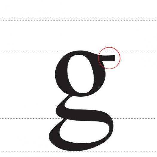
- 16.
A small stroke extending from the upper-right side of the bowl of lowercase g.
- A.
Ear
- B.
Leg
- C.
Arm
Correct Answer
A. EarExplanation
The small stroke extending from the upper-right side of the bowl of lowercase g is commonly referred to as the "ear" of the letter. This unique feature is not present in the letters "Leg" or "Arm". Therefore, the correct answer is "Ear".Rate this question:
-
- 17.
A stroke added as a stop to the beginning and end of the main strokes of a character.
- A.
Serif
- B.
Stem
- C.
Tail
Correct Answer
A. SerifExplanation
A serif is a stroke that is added as a stop to the beginning and end of the main strokes of a character. It is a small decorative line or curve that extends from the main strokes of a letter. Serifs are commonly found in typefaces that are classified as serif fonts, such as Times New Roman or Georgia. They are often used to improve legibility and add a touch of elegance to the characters.Rate this question:
-
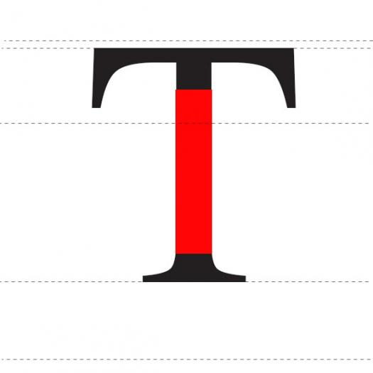
- 18.
Vertical, full-length stroke in upright characters.
- A.
Arm
- B.
Stem
- C.
Crossbar
Correct Answer
B. StemExplanation
A stem is a vertical, full-length stroke in upright characters. It is the main vertical stroke that forms the backbone of the character. The stem is typically straight and can be found in letters such as "I", "T", and "H". It provides stability and structure to the character.Rate this question:
-
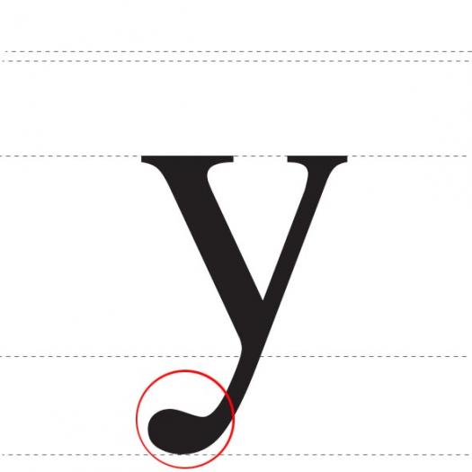
- 19.
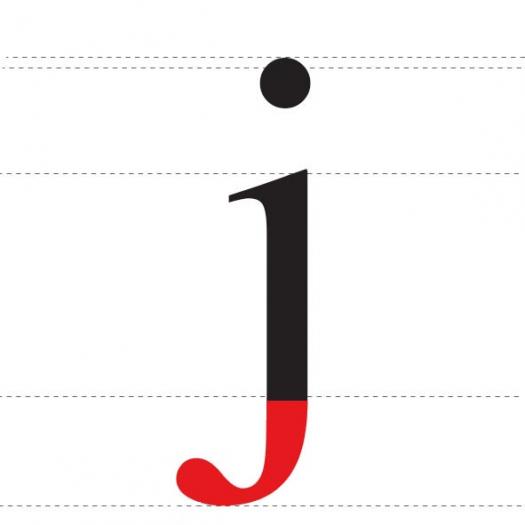
A descending stroke, often decorative.
- A.
Tail
- B.
Descender
- C.
Baseline
Correct Answer
A. TailExplanation
A tail is a descending stroke that is often used decoratively in various contexts, such as in typography or calligraphy. It is typically a curved or straight line that extends below the baseline of a letter or symbol. The purpose of a tail is to add visual interest and enhance the overall aesthetic appeal of the design.Rate this question:
-
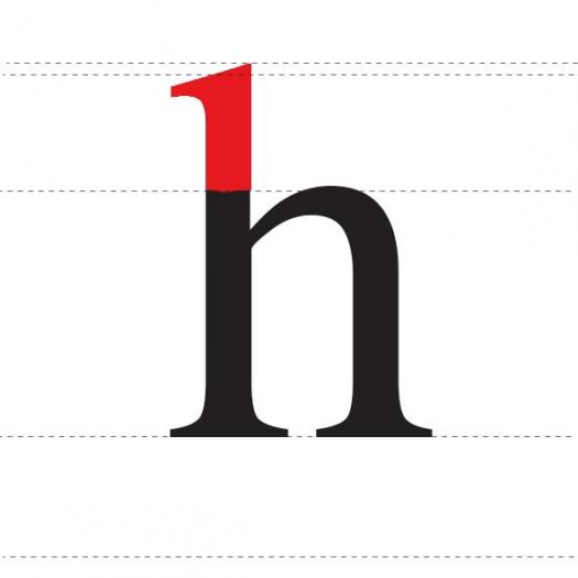
- 20.
An upward vertical stroke found on the part of lowercase letters that extends above the typeface’s x-height.
- A.
Descender
- B.
Arm
- C.
Ascender
Correct Answer
C. AscenderExplanation
An ascender is a vertical stroke that extends above the x-height of lowercase letters. It is commonly found on letters like "b," "d," and "h." This upward stroke adds height to the letterforms and can help differentiate between similar letters. The other options, descender and arm, do not refer to strokes that extend above the x-height. A descender is a stroke that extends below the baseline, while an arm refers to a horizontal stroke in a letterform.Rate this question:
-
Quiz Review Timeline +
Our quizzes are rigorously reviewed, monitored and continuously updated by our expert board to maintain accuracy, relevance, and timeliness.
-
Current Version
-
Mar 22, 2023Quiz Edited by
ProProfs Editorial Team -
Jul 21, 2015Quiz Created by
Arowley
 Back to top


